


Most of us are concerned about traffic. Many of us grapple with it daily. But for traffic analysts and city planners, traffic data is the reason they get up in the morning and go to work because traffic incurs a heavy cost on the economy. There are direct costs from lost time, wasted fuel, and increased wear on cars, but there are also many indirect costs, such as freight delays, increased shipping costs, unreliable pickup and delivery, more crashes and ensuing need for emergency response, less access to jobs, increased pollution, and more – not to mention the stress traffic causes drivers.

Traffic congestion continues to cost US cities billions every year. While the cost of gridlock has not reached pre-pandemic (2019) levels, 2021 showed a significant increase over 2020 in the cost of traffic for most cities.
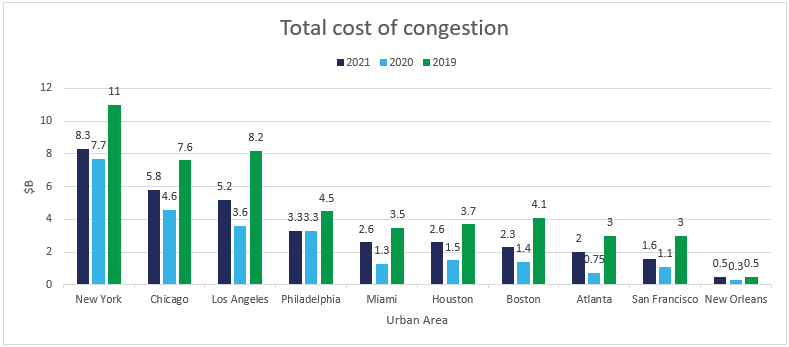
Data Source: Inrix 2019, 2020, and 2021 Global Traffic Scorecard
Not surprisingly, city planners building intelligent transport systems are scrambling to improve traffic flow, but to help commuters get to work more quickly and delivery vans make their drop-off in time, they have to understand what’s causing the traffic.
There are 3 key factors to understanding traffic flow:
- Collecting traffic data (from within the flow)
- Processing the data (ensuring it’s rich, consistent, and of high quality)
- Visualizing the data
Collecting Traffic Data
Leonhard Euler and Joseph-Louis Lagrange are two distinguished mathematicians who lived in the 1700s and (among many other things) studied flow. Euler’s study of flow was based on focusing on a specific location through which the flow passed. This is similar to traditional methods of measuring traffic flow by putting counter lines or cameras at specific locations on the road network. But this method involves a lot of infrastructure (equipment plus cabling), and it’s not scalable, so you have to guess where the best places to measure traffic flow are.
Lagrange studied flow by focusing on an individual fluid parcel as it moves through space and time. This relates more to following cars as they move through the road network and is a much more effective way to study traffic. Effectively, every single car is a sensor. As long as you can get data from the car, it’s completely scalable and fully covers the whole road network.
Processing the Data
The insights you can get from traffic data are only as good as the data itself. The data must be of a high quality, rich in attributes, accurate, and reliable. To accumulate an adequate volume of traffic data, you’ll need several sources such as multiple OEMs, fleets, and TSPs. Since each data provider may use different formats, the data from the different sources must be standardized to one consistent format. And because data streams always contain errors, you’ll need to run them through correction algorithms to fix or remove erroneous data points. And to remain compliant with privacy regulations, the data must be anonymized to remove any personally identifiable information. Once the data has been properly processed, it should be available as one coherent database through a single, standardized car data API.
Visualizing the Data
The data you have for traffic management is a gold mine – but you still have to dig for it. There are billions of data points, each with many properties. The data changes over both space and time and looking at a sea of numbers doesn’t tell us much. It’s impossible to extract information by looking at the raw data points.
One way to make traffic data more palatable is to visualize it. Humans are visual beings, and by using advanced analytics and sophisticated tooling, we can visualize the data to see it in a completely different and more meaningful light.
Xyzt.ai is a visual analytics platform that does exactly that. It lets you display data visually to extract meaningful insights. The rest of this post will use an example of a reference implementation they demonstrated in this joint webinar with Otonomo, showing how to use connected car data to get insights on traffic flow in Munich and Los Angeles.
Visualizing Traffic Density with Heatmaps
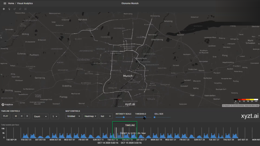
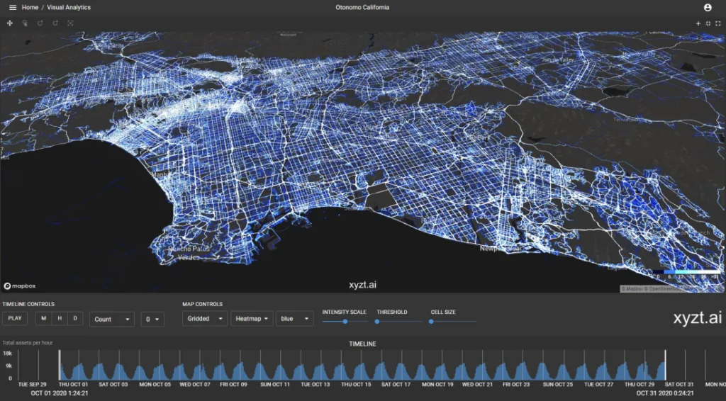
Let’s investigate traffic congestion in the city of Munich, Germany. The map below represents over 60 million data points collected over a 1-month period. Creating a heatmap from those data points translates vehicle density to a color (blue = few vehicles; white = many vehicles), which immediately highlights hot spots and congested arteries that warrant investigation. The histogram on the bottom also highlights the number of vehicles in the view, showing the typical morning and evening commutes and less traffic on the weekend.
Insights:
- Main congested arteries in the area you’re investigating
- Heavy traffic times for morning and evening commutes
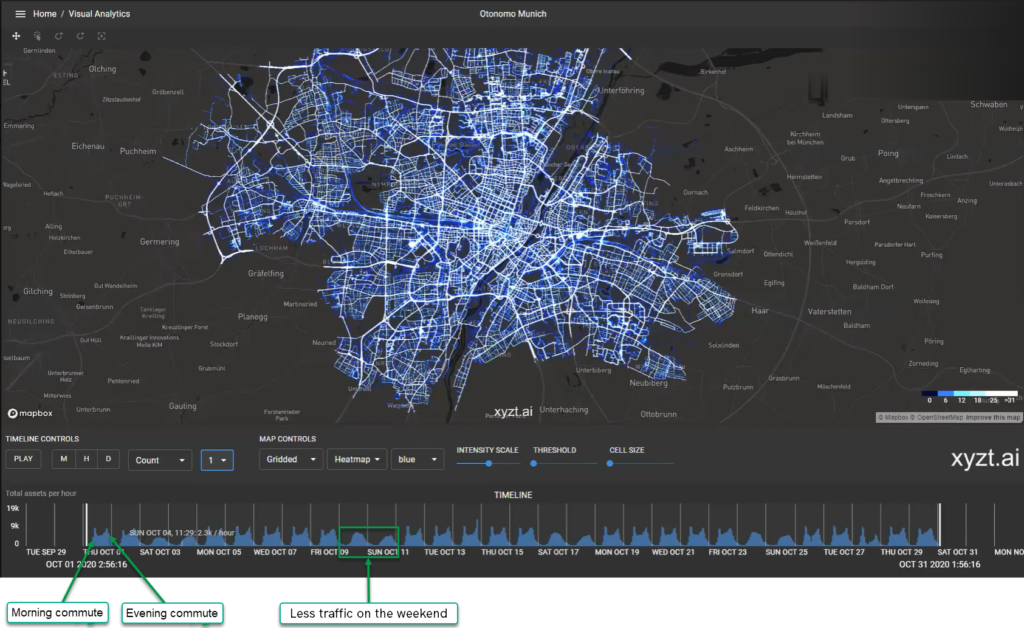
It’s worth noting that getting this kind of data over such a large coverage area using traditional traffic counter lines and cameras (the Euler method) is impossible.
Attributes used:
| Attribute Name | Description |
| location__latitude__value | The GPS latitudinal location of a given vehicle in decimal degrees (WGS 84). |
| location__longitude__value | The GPS longitudinal location of a given vehicle in decimal degrees (WGS 84). |
| metadata__time__epoch | The exact time of a given point (UTC) in epoch format. |
| vehicle__identification__otonomo_id | A unique vehicle’s identification number created by Otonomo. |
For a full list of attributes, visit the Otonomo platform documentation.
Filter the Data to Get More Insights
Filtering the data helps you focus on interesting information. To highlight the arteries with a high traffic count, we can raise the threshold for display and only show those roads with a large number of vehicles. And by moving the time line around, we can easily discover which roads are congested on weekdays vs. the weekend.
Insights:
- Most-congested roads
- Variation of congestion between weekdays and weekend
We can also see exactly how fast all these vehicles are traveling. Let’s apply a filter on speed and see how many cars are speeding beyond 120 kph.
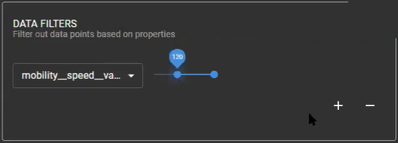
Attribute used:
| Attribute Name | Description |
| mobility__speed__value | The vehicle’s current speed in km/h (ODB-II-PID:0D). |
We can now zoom into any section and see where people are speeding.
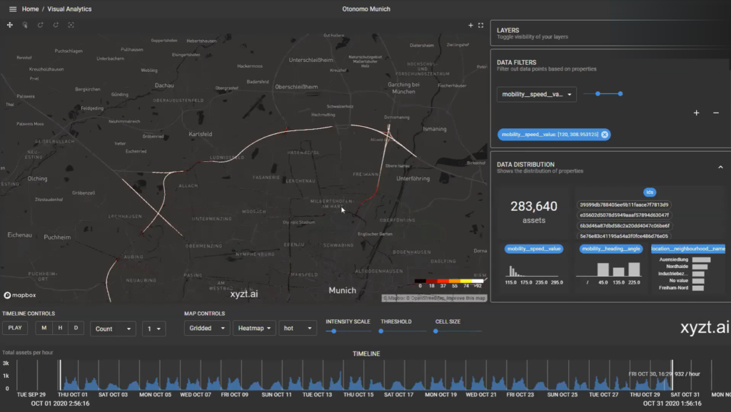
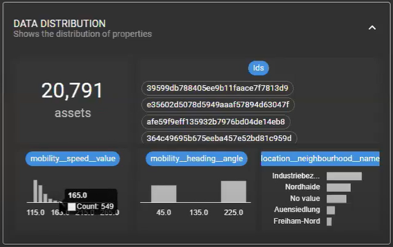
Looking at the distribution of speed, we see some get as high as 165 kph.
This kind of analysis might tell us where we want to launch our next sensible driving campaign.
Insight:
- Potential accident hot spots
Heading Matters
Otonomo also has full coverage in California, so let’s head over to Los Angeles, where traffic is a way of life. Viewing data points in LA, it’s easy to see it’s one of the most congested cities in the US. And looking at the time line at the bottom, it seems that traffic is equally heavy on weekdays and weekends.
Palm Springs is a popular weekend getaway from LA, but holiday makers are always complaining about the traffic getting there. Let’s zoom in on Interstate 10, one of the main routes from LA to Palm Springs, and compare east-bound traffic to west-bound traffic. You can do that by splitting the screen and applying the corresponding heading filters on each side.
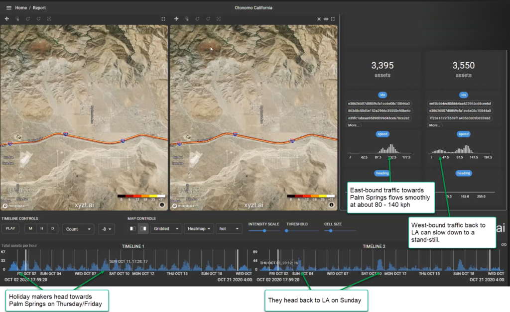
Displaying the data like this easily shows that east-bound traffic toward Palm Springs peaks on Thursday and Friday when people are heading out for the weekend and flows well, with speeds ranging from about 85 – 140 kph. But west-bound traffic, which peaks on Sundays when people are returning to LA from their weekend getaways, slows down significantly, even coming to a standstill.
Attribute used:
| Attribute Name | Description |
| mobility__heading__angle | The angle between the vehicle’s direction in comparison to the north in degrees. |
Beyond Traffic Management
It’s clear that the Lagrangian paradigm for measuring flow is far superior than Euler’s method when it comes to measuring traffic. Otonomo’s traffic data is the embodiment of Lagrange’s method, where each vehicle acts as a sensor in the flow. Using Otonomo traffic data, urban planners can manage traffic at scale, reaching every corner of their target geography, and drill down to any intersection or highway on- or offramp for details. Using visualizations to analyze flow with Otonomo’s rich data sets, they can improve real-time traffic flows, adjust traffic signals and ramp metering lights, quickly detect traffic accidents or vehicle breakdowns that block the flow of traffic, plan public transport routes more effectively, and much more. But Otonomo offers more data sets that cover a wide range of use cases. Check out our Road Sign data to identify missing or damaged signs, or our Hazard data to improve road safety, and much, much more.
Want to learn more about data sets available from Otonomo? Click here to schedule a call with one of our industry experts.


More Stories
What You Should Know Before Filing a Car Accident Claim
Injured in a Car Accident in St. Louis? Here’s What to Do Next
Historic Sportscar Racing (HSR) and Goodyear Announce Multi-Year Partnership